Hallucinatory Color in Landscape Art
The evolution of color in landscape art.
Color in landscape art has evolved from naturalistic tones deriving from the earth itself, into a completely unrestrained range of expressive color.
It came a long way to get to this point, and it has been one beautiful transformation after another. This article is my magical mystery tour through color in landscape art. I must tell you upfront, I have cherry-picked examples of representative artists throughout, and my take on this subject is hardly the last word, nor is it thesis material for a PHD.
If you’re an art history buff, you undoubtedly have some favorite examples I didn’t touch on. You’re cordially invited to enthuse about your own examples on Facebook. As always, be nice; enthusiasm makes the world go round.
The first examples of pure landscape art
The landscape genre in art, (that is, works of art featuring landscape exclusively as a subject matter), began in ancient times. The first examples of art featuring just landscape, without other subject matter in them, were Minoan frescos from about 1500 BC.
The Greeks and Romans created wall paintings depicting purely landscape and garden-scape scenes. My wife and I had the chance to tour the ruins of Pompeii in 2008, and there you can see that landscape art was used mostly to extend the ambiance of walled gardens.
The colors in those works were mostly natural earth pigments mixed into the wet plaster fresco, with some blue shades for skies deriving from lapis lazuli, I believe.
But mainly palettes were muted, and saturation was tethered to the origins of the pigments they used.
Landscape watercolors of the orient
In China, the Yuan and later the Ming dynasty landscape painters worked in watercolor and ink. Palettes were earthen, but unlike much western art, line plays a dynamic role. Focal points within oriental landscape painting come to life in an almost animated way. Rhythm of pattern is way more vigorous than just about anything in pure landscape art of the west. Dynamic range was incredible, but color was limited.
The Netherlands in the 1500’s was one of the first places where landscape painting became a popular subject for painting, and where it began to build a permanent legitimacy as subject matter unto itself, rather than existing just as background material in a scene.
Classical landscape painters: restrained, naturalistic color
The classical landscape painters of the 17th century academies, like Claude Lorrain and Nicolas Poussin featured more interesting light effects, so light vs. dark began to build in range but still color was restrained, soft, and subdued in their paintings.
Even in the mid 18th century color was still naturalistic and saturation of color tones were limited, and in fact further delimited by the imperative of historical accuracy in landscape painting, as practised by Valenciennes and Corot.
Turner and the Impressionists: color begins to decouple from earth tones
The art of JMW Turner advanced light and texture and loosened up overall form in landscape but color not so much.
Then came the impressionists, and color in landscape art began to decouple from the earth-derived tones that limited it for centuries.
We began to see flecks and dabs of primary colors infused into the shimmering, atmospheric scenes where land and sky and sea could become more and more ambiguous. There was a loosening and more separation of color from the strict physical appearance of the scenes depicted.
The spirit of the scene emerges
Monet took color in landscape to a bolder and more independent stature and prominence: flourishes of color started to become expressive components of the underlying feeling and spirit of the scene, as distinct from its natural appearance. His water lilies show passages of pure expressionist color. Color use that makes sense within the logic of a painting, not necessarily making a naturalistic statement.
Color takes on a central role
Seurat’s pointillism advanced the role of color in landscape art even further, exploiting color’s ability to combine into vibrant, scintillating energy way beyond what a flat tone could produce. His use of color was much more carefully calculated, yet still achieved a higher role in the total impact of a painting.
Van Gogh took color into a more personal, expressive mode. His paintings settled once and for all the idea that color itself could feature as an autonomous expression. His art opened up a vast new field of expression with its idiosyncratic, bold coloration.
Color really begins to come across as a living spirit of the thing it depicts.
Modulated and fragmented color hallucinations
Cezanne modulated color in conjunction with broad strokes to achieve a breakthrough in landscape art. The separate stokes tend to take on an identity of their own.
Picasso and the cubists took this idea to extremes, breaking with physically observed form and exploding the various planes of light and shade into analytical, almost crystalline interpretations.
Truly hallucinatory effects were produced.
And speaking of hallucinations, the work of Paul Gauguin may have actually been inspired by a substance or two. Some of his late landscapes are masterpieces of vibrant color.
Wildly expressive color dominates
Picasso progressed beyond the intellectualized style of cubism, loosening up the rigidity of expression, and becoming wildly expressive, both with form, line, and color.
Matisse and the Fauvist painters amped up color to a point where it actually took over the main impact of a landscape painting, with bold, and importantly, very broad swaths and gestures of intense hues. This intensity of hue and looseness of form give Fauvist works a fantasy-like appearance.
The color in a landscape now became the dominant thing!
The spiritual dimension of color in landscape art
Canadian landscape artist Lawren Harris took color into an almost spiritual dimension with his bold, iconic compositions of Canada’s north. The group of seven painters each brought their individual approach to color in landscape with bold strokes.
Georgia O’Keefe brought a dramatic color palette to landscape art, and magnified the most colorful natural element in the landscape – flowers – into the entire subject matter of many of her paintings.
Color takes on a life of its own
Color later began to take on a life of its own, even while it still retained some atmospheric references to landscape. Abstract expressionist artists like Helen Frankenthaler took broad, loose swaths of color beyond any conventional depiction of landscape into a world unto themselves, floating on dreamy fields of color, while still referencing the feel of landscape.
Jules Olitski drew out the fullest atmospheric potential of a single hue in his paintings, using a spray gun.
Abstract artists like Paul Jenkins took intensely saturated liquid paint and allowed the liquid physical characteristics of the paint to dictate form in a totally organic way. And yet, despite no pre-conceived idea of horizon or even gravity, his works still hold the essence of landscape.
Color field painting meets landscape
Landscape artists like Wolf Kahn have steered color field painting into the forms of landscape, building up large areas of color articulated by a loose framework of natural detail as grace notes.
Recent years have seen artists take the expressive power of color into entirely new dimensions in the art of landscape.
Freedom and expressive power in color
Artists like Gerhard Richter take pure hues and infuse them into several abstract styles of art, from geometric stripes suggestive of horizontal fields and the motion of a speeding car or airplane, to painterly vertical swaths of color that bring to mind sunlit trees in the forest.
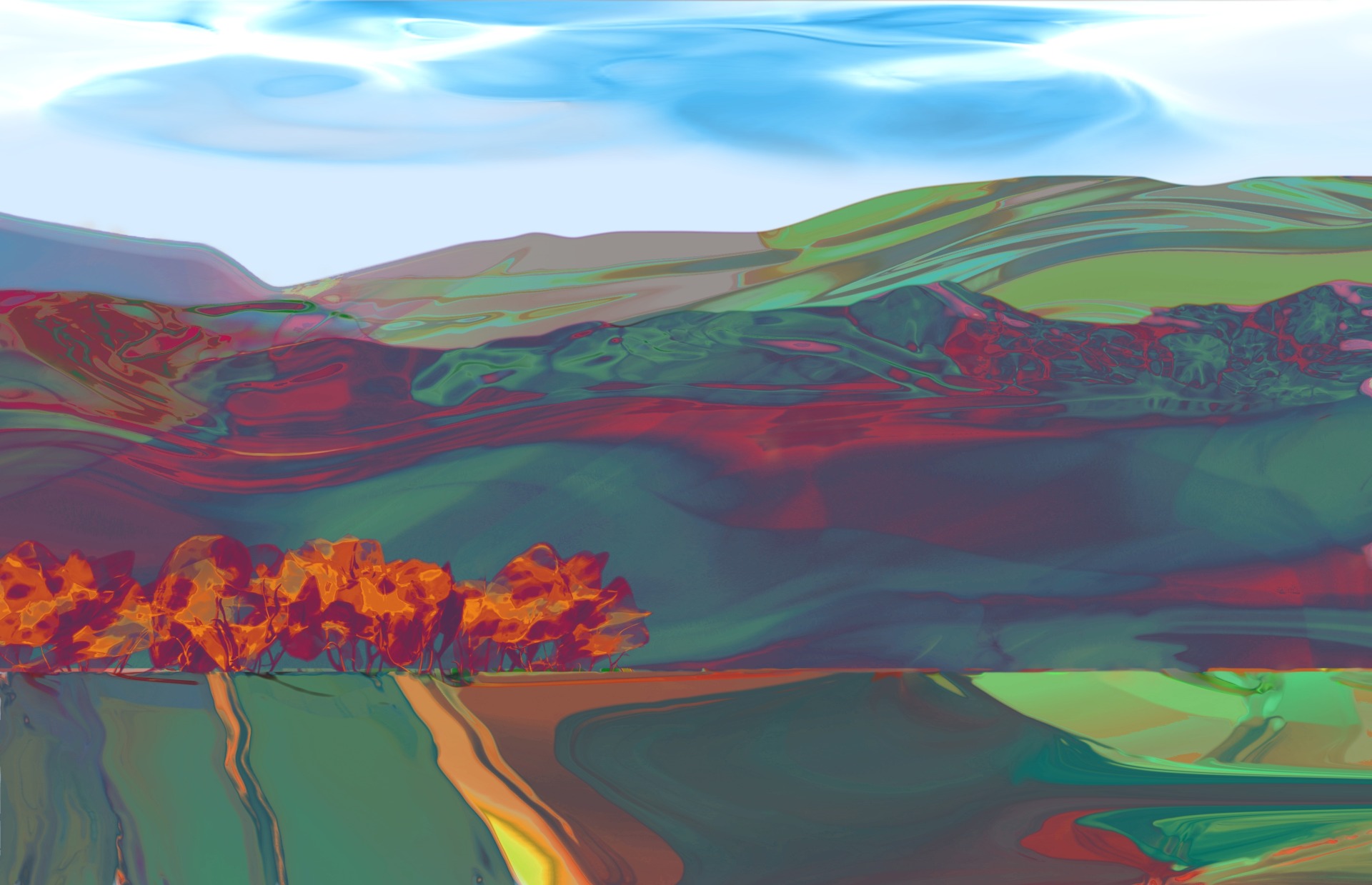
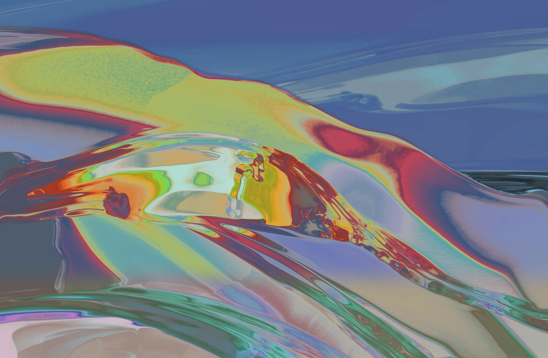
My own landscape art makes much of that freedom of color to express a spirit and energy that can seem hallucinatory and dreamlike.
Contrapuntal rhythms of color in landscape art
I like to push color to its limits, and introduce hits of high intensity hues that serve to energize my work. I take inspiration from classical music in its contrapuntal rhythms, to articulate bold color forms.
And I like to channel the spontaneity and the broad fields of color from abstract expressionist painters into works of landscape art that resonate with that hallucinatory feeling of bold color.