Eco Architecture and the Digital Landscape

The aesthetics of eco-architecture.

The aesthetics of the most significant eco architecture draws upon the environment.
The land. From curving balconies that undulate like shore lines to rainforest-evocative vertical gardens, architects and designers reference the shapes and lines of natural forms.

But despite the organic look and feel of the finished structure, most of these building designs, once past the initial gestural “napkin sketch” stage, are executed with digital tools. Concept is “earthen”, then development is “techno”. That’s quite a span. Yet top architects and designers integrate the two routinely.

So what better choice of art to display in a modern design that exudes the rhythms, proportions, colors, and feeling of the earth, than a digital landscape?

Thematically compatible

Digital landscape art combines thematically with leading edge eco-architecture, and makes a solid choice for any designer. Landscape art of some kind has the obvious reference to link the design and the building to the environment, and the digital nature of an art print created with 3D animation software embraces the opposite end of the continuum. Quite a span as well. And quite appropriate artwork for a design that does the same.

Digital landscape art can fuse the two concepts together with panache.

For a corporate client whose business spans environment and technology, a well conceived digital landscape print can be one of the crowning touches that brings a designer special recognition from a typical corporate culture of rigorous logic.

As far as addressing the techno end of the rationale logically, much green technology is in fact digital: energy analytics, home automation, power management and many other green and clean technologies are built around environment-based data. And the digital software used to create the artwork is in fact spawned by data. So they come from the same source in a way.

Imagination gives life to digital art

The magic however, is how the artist, the creator of that art, gives life to the subject: how well they weave the fabric of the imagination into a genuine, creative work of art. How well they go beyond the mere representation of reality, and conjure up the spirit of the land.

For designers and architects there’s an opportunity to put the finishing touches into a sustainable building that complement its purpose and meaning.

Magical 3D Artistry From the 1300’s Casts a Spell in Spain

In Southern Spain, one of the great sights in Europe casts a mysterious spell on all who visit: the Alhambra. I visited this opulent Moorish palace in 2000, and its magic still resonates within me.

Under a warm Andalusian sun, my wife and I made our way into the palace, after 4 hours soaking up the exotic ambience  of the surrounding gardens. From the outside, the Alhambra is modest, simple, and understated.

Then you step inside, and enter another world.

We slowly wandered through halls and courtyards, past reflecting pools and inner chambers in  this otherworldly palace. Everywhere, across almost all surfaces, spectacularly ornate, complex carvings and geometric reliefs catch the sunlight… and fool the eye, like an architectural magic show. Time after time I got up close to look at the elaborate relief carvings covering the walls and ceilings.

The patterns are hypnotic.

At one point, I stood in front of a section of fantastically complex carving, and tried to focus my eyes on which areas of the pattern were actually concave, or hollow, and which were convex. Couldn’t do it. Mister visually trained, yours truly,  the 3D guy, could not reliably resolve the 3 dimensional order of the forms I was looking at.

The sun lit this particular section at such an angle that the eye’s sense of depth shifted back and forth, like an M.C. Escher drawing. Only this was real.

As a 3D animation professional, trained thoroughly in fine arts back in the 70’s, experienced in design, illustration and computer graphics and then animation, over more than three decades working in advertising, I was humbled. And dazzled. Cross-eyed dazzled, in fact, by a close-up view of an incredible pattern of optical illusion, built right into the architecture itself.

The whole experience really did cast a visual spell. And that’s the interesting thing…

Not all magic is cheap trickery. Some of it is real. The artisans and sculptors who created the Alhambra conjured up real visual magic.


In a sense, their complex patterns of delicate carving are the ancestors of the pixels we work with today. All digital imagery is in fact made from patterns. Patterns of tiny picture elements, hence the word “pixels”.

Using contemporary digital tools, there are opportunities for artists to cast something of a spell too.

That’s been my aim for a long time.

Who’s Afraid of Digital? Not This Landscape Artist

Digital.

Art.

Print.

How do these words relate?

Isn’t a print a physical object, mutually exclusive to a bunch of pixels on a computer screen? And can a digital creation be a work of fine art?

There seems to be a spectrum of uncertainty around the word digital, and all that it implies, especially relating to the world of fine art. Where you are on that spectrum will determine your comfort level with the works of many up-and-coming artists who have embraced digital creativity and are integrating it into their process and their work.

So if you are on the lookout for rising stars in the art world, you’ll want to get warm and comfy with digital. It’s here to stay, and it’s not just about video artists. There’s a lot more to it, and it’s far more exciting than you may have imagined.

So here we’ll look at a few intriguing ideas surrounding digital creation. By the end of this article I hope you’ll be just a little further along that spectrum, towards the warm end, and your comfort level higher.

Speaking of comfort level, a quick story: during the mid 1980’s I was an illustrator/designer working for one of the biggest advertising photography studios in Canada. Back then, all our work was created by hand, using drafting equipment: set squares, compasses and ink pens on smooth white art board. Hand crafted. I remember hearing all kinds of alarming rumors about “computer graphics”, how brutally efficient and precise they were, and how “they”, an evil cohort of computer “operators” were going to put all of us artists out of a job. It felt like being stuck inside a stalled car in the middle of railway tracks, with a dark train hurtling towards me.

Fast forward to late 1994 and I was starting my own freelance 3D animation business. So what happened in between? I accepted it. Grudgingly, I admit. Then I began studying it. Started to actually get fascinated by it. Then full-on excited by the possibilities, as not only 3D animation, but photography and graphic arts embraced digital, and it got more and more sophisticated. Not just faster, more efficient, etc. But richer, better, and vastly more sophisticated entirely.

My comfort level evolved rather a long way along that spectrum! Yours can too.


So let’s tap into a few uncertainties about digital, and see what we can resolve.

Does digital = ephemeral?

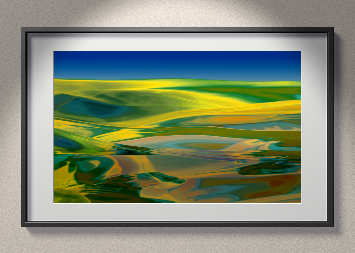
By ephemeral, I mean without any physical, tangible form. Is a digital creation necessarily forever locked within a screen of some sort, either a computer monitor or a TV? Not at all. And this is one of the pivotal ideas here: digital can be the starting point, but doesn’t have to be the finished product such as a 3D animation. My own art is in this category: I use 3D animation software to initiate, explore and create digital works, but at the end of it all, they are intended to be fine art prints. Digital can be a means, not an end.

Does digital = “mechanical?

Circling back to the story above, one of my greatest fears was that all the life would be squeezed out of illustration by computer “operators” running very technical software. The human touch would simply evaporate without leaving so much as a fingerprint. For a while, it almost seemed that it really would play out like that, and “computer art” or “Mac art” was a dirty, derogatory put-down.

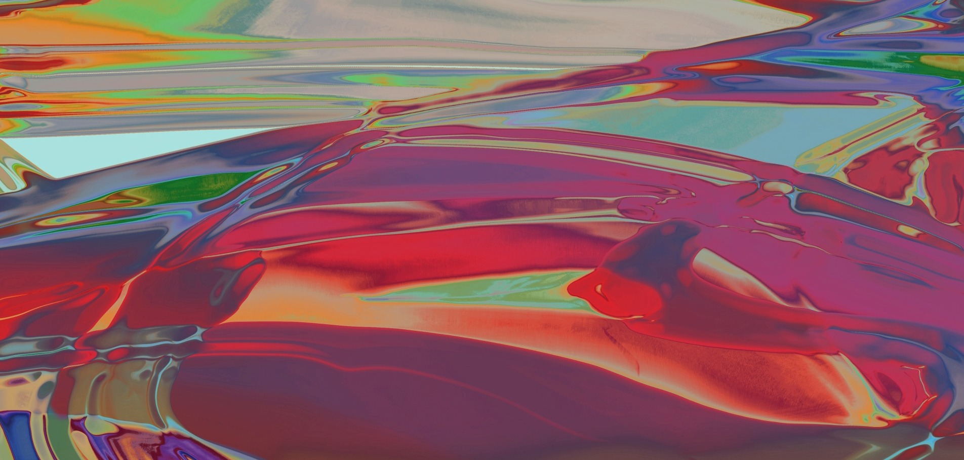
But life and art move forward, and today technologies of all kinds allow us to make organic, capricious, painterly, and natural forms and textures. Fractals are used extensively in 3D animation textures, for example, and are so variable and complex that they can produce photo-realistic terrains for movie special effects. But digital textures are not chained to realism, and can simply be played with, to create entirely original visual expressions.

I do it all the time, so do other artists.

Digital = Experimental

Digital can allow artists to be wildly experimental at the front end of their artistic process, no matter what their end medium. The key thing about digital creativity in the fine arts is that it’s not locked down, in the early stages of work. It’s far more open-ended.

You can experiment endlessly if you need to, saving out your work in various iterations, and choose from the best. Or combine different elements. Or delete elements. In many ways the digital process is a lot richer due to this early stage flux. You can commit to a final iteration after you have tried variation after variation. Unlike direct painting, where you commit very early on, and can’t go back or sideways a few steps to re-think, refine and finesse.

Digital = Flexible

A digital creative process can be as deep or as brief as suits any given artist’s temperament. It does not have to be the entire story, as with 3D animation, digital video or graphics. My own process is mostly digital, but the final end artwork is a physical fine art print, output onto the best quality archival paper, then framed.

But many painters come at it the opposite way: they make a painting, then use digital photography to capture the work, and make the print from there. Some artists even go back and forth between physical and digital, and that’s great. Digital is a two-way street, not one-way.
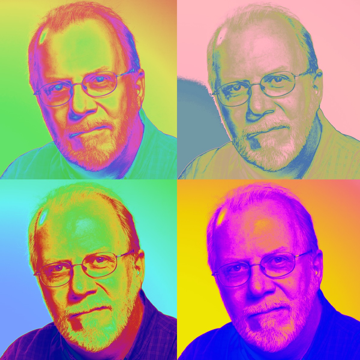
Digital = Accurate

Color can be controlled and finessed in the digital realm far more than with paint. Once in the digital color space, an artist can refine color with some incredibly versatile tools, to achieve the precise color balance she wants.

An artist who creates a painting, and then wants to change all the colors of the painting subtly or boldly has very limited options, such as glazing over with transparent paint. And that essentially changes the work’s character to something else.

But digitally, they can modify to exactly the hue, saturation and brightness they desire.

Digital = Prolific

Carrying on from the above, a digital work can remain inside a computer, or be output to a series of art prints. And it can also be output as a pre-painting study. This allows the artist to improvise then refine their work, before using the digital output as a guide, similar to drawing-and-color studies in ages past, to create a finished large scale painting.

Yet another aspect of digital is the fertile nature of it, its ability to be reproduced many times without the source suffering any kind of degradation. That’s in contrast to silkscreens and etchings, in which the source masks or plates will wear after many copies.

Finally, the prolific nature of digital art can allow artists to spread and multiply their exposure, thus building a reputation faster. How quickly can a reputation be built, 20 prints at a time? That’s pre-digital career growth. Open edition digital art prints can be enjoyed by a much larger audience in much less time. And can then be followed by more exclusive offerings, once a wide base of exposure has been built.

Digital = Authentic

What about limited editions? How can artists secure digital print editions so as to truly limit an edition of a print? In this age of art forgery and fakes, it would be possible to take a digital work and print out, say, 100 versions of “print #1″, offering them to different markets. Or claim to destroy all digital versions after a certain number have been printed.

Those are indeed possible, but they rely on basically one person’s word. And these days there are digital security features and methods that, similar to PGP data encryption, require the input of a second party to complete a verification.

It’s possible to build tiny, incredibly subtle, encrypted watermarks into digital prints and then use lawyers to register and record the other verification component of a code, to protect and secure limited edition digital prints. Beyond this, digital authentication is a technology enjoying an explosion of interest and development. For more information and news, Google ” digital authentication technologies”.

I am planning the release of limited editions of my own works in the future. They’ll all use some pretty sophisticated systems to protect collectors. If you’re interested, please enter your email address in the opt-in form to subscribe to my personal announcement list, where I will announce new developments.

Digital = Archival

Digital printing advances at a spectacular rate, and is rapidly closing the gap with traditional fine art printing inks. The longevity of digital art printing inks has been driven mostly by fine art photography. Prints have been the foundation of many photographer’s reputations for many years. Ansel Adams is a perfect example.

Harald Johnson, author of “Mastering Digital Printing” says in his 2nd edition of the book “When I recently called Craig Krull of well-known Craig Krull Gallery in Santa Monica, California, to check in on inkjet’s adoption by the art gallery world, he explained that “most photographers are doing it today, even William Eggleston.” He continues, “As long as it’s pigment vs dye inks, and it’s archival or holds up over time, I have no problem including digital pigment prints in the gallery.”

Inks, papers and printing technology are advancing at a spectacular pace, and there are now pigment / paper combinations that are as accepted in many of the best art galleries as previous forms of art prints.

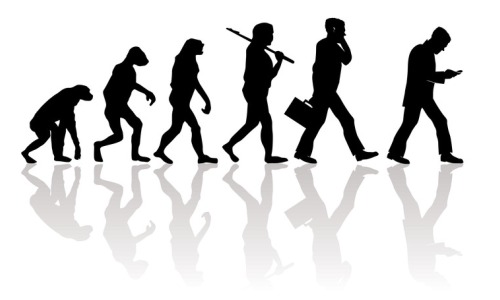
Does digital = evolved?

That’s up to you! What do you think about digital fine art prints at this point, given the above? Are you somewhat more open? As I mentioned at the beginning of our little journey, I was intimidated and mistrustful of most things digital, and at the beginning grossly underestimated it.  But, life and art move forward. Hope I was able to help you move your comfort zone just a little, along that spectrum.


Prairie Art Re-Imagined

“Nothing could be more lonely and nothing more beautiful than the view at nightfall across the prairies to these huge hill masses, when the lengthening shadows had at last merged  into one and the faint after-glow of the red sunset filled the west.”

Theodore Rooseveldt

The prairies tend to be neglected in landscape art, and art in general. I hope to change that decisively with an ongoing series of abstract-like prairie landscapes, originating in the digital realm, and realizing tangible form in a series of art prints.

My aim is to bring new life and original feeling to the landscapes of the prairies and rolling farmland, beginning the creative process with digital tools and all the rich potential they have to re-imagine prairie art into a more modern, abstract feel.

Personally, as an artist I find prairies and rolling farmland to be some of the most compelling subjects for landscape art.

Driving through rolling farmland is a sensual delight. One experiences the cadence, meter and rhyme of all the natural visual textures at a much more heightened level of sensitivity than if we walk. At a walking pace, the changing rhythms don’t dance the way they do when one smoothly flows through the landscape in a car.


“I was born on the prairies where the wind blew free and there was nothing to break the light of the sun. I was born where there were no enclosures.”

Geronimo

The long sightlines bring a sense of peace and well-being, quite unlike the city, where buildings crowd the view, and the average optical range is much more close-up. Obvious when you think about it, but, as many who travel out of the city on summer weekends to country homes and cottages will agree, profound in feeling.

There’s a reason so many love to take to the wide open spaces after a week in the city. Even if they love the city!

A lot of very static, formulaic art has been created around a kind of desolate flatness and unchanging character of land and sky, with each generally occupying half of the view, and very little counterpoint of texture or rhythm. Many are the modern offspring of Mark Rothko’s color field paintings, which are both more original and sophisticated.

My own work brings a different set of natural rhythms into prairie landscape art, and tends to feature more flowing terrain. I have a much more lyrical take on prairie farmland.

Rolling hills impart a grand sweeping rhythm to my art, and tend to invoke the feel of classical music, with it’s cyclical undulation and graceful flow of line. And I find clusters and streaks of vegetation in farm country to be very painterly looking, like broad brush strokes and dabbled or even poured paint. Far from being uninteresting, rolling farmland and plains have their own rich tapestries of texture.

My working method is perfectly suited to this subject matter.

It originates with the smooth flow of reflections and refractions in 3 dimensional digital forms, very glass-like. It’s a perfect source for prairie art to take form and shape from. The graceful lines of reflections, once they are digitally finessed, translate naturally into the landscape of rolling hills with subtle ebb and flow.

For exclusive insights into my process, sign up for my personal announcement email list.

Rolling farmland and the prairies are such magnificent places. I am working steadily to re-imagine prairie art into a more contemporary, abstract art form.


Visual Tone Poems: Landscape Art Inspired by Classical Music

The color of music.

Painting has color. So does classical music. All my adult life I have intensely enjoyed the many connections of tonal quality between the two art forms. Read on, and see if you feel the same.

Both arts radiate tonal color, and certain styles of expression within each art form accentuate color as the dominant characteristic of the work. Some abstract paintings for example, are built around color itself. It’s literally what they are all about. Form is present just enough to articulate large swaths of rich hues, without being deliberately descriptive of anything in the real world. Color rules.

Classical music can be every bit as rich, but the colorful tones tend to conjure up imagery, oddly enough. Tonal color in orchestral music can be just as expressive as different hues and shades in painting. They are painterly, but in a musical sense. And probably the most painterly of all musical forms is the tone poem.

The tone poem: evoking the feeling of landscape

According to Wikipedia, a tone poem in classical music usually refers to a piece of orchestral music, most of the time in a single continuous movement, which illustrates or evokes the content of a poem, short story, novel, painting, or landscape.

As a landscape artist, the “tone” reference is of particular interest to me. It opens up the audio space to such an extent that it invokes real 3 dimensional space in my imagination and senses. And I love to carry that feeling through all of my artwork.

Often, if a piece of music has certain characteristics, the space it invokes is the feeling of a landscape, whether intimate or grandiose. Landscape forms share so many similarities of structure with classical music, particularly symphonic pieces: peaks, valleys, abrupt cliffs and gentle slopes all feature in the topology of music.

Contours and textures

Listening to certain pieces of music I get a real sense not only of contour, but of texture and atmosphere and even altitude as well.

What about you? Do certain pieces of music lift you right out of your chair and carry you off into nature? What pieces transport you to the hills, to the mountains, to the sea? Feel free to comment on my Facebook page.

Here are a few personal selections of music that inspire the feeling of landscape within me.

Music that inspires the sense of landscape: a few personal picks:

Beethoven Symphony #7

First up is the Beethoven symphony that gave me my epiphany of awareness around the age of 25 while on a road trip through the Adirondack mountains around Lake Placid, New York: Symphony #7. The first movement sostenuto, with its expansive chords, immediately evokes for me glimpses of the grand scale and lush green textures of towering mountains, seen through gaps in the trees while driving through the valley roads. And the second movement, the allegretto, never fails to lift me up, higher and higher, through patches of fragrant mist, up the climb to the peak of Mount Washington. A breathtaking experience, magically conjured up through music.

Beethoven Symphony #6, the Pastoral

Probably the most famous, the rolling hills of Beethoven’s 6th symphony, the “pastoral” is one piece that almost anyone who hears it acknowledges as a landscape for the ears. Yes, it is actually titled as such: Beethoven’s full title was “Pastoral Symphony, or Recollections of Country Life.” So sure, we’re predisposed to consider it as the musical impression of a landscape, but Beethoven the landscape artist created such a masterpiece of natural musical forms, rhythms and contours that the connection totally rings true.

Peer Gynt Suite, Edvard Grieg

Another famous piece that invokes the feel of a romantic vision of nature is “Morning Mood”, first movement of the Peer Gynt Suite #1 by Edvard Grieg. The title still somewhat hints at an outdoor scene but even if it were untitled, there’s no doubt that it would conjure up a beautiful landscape in one’s imagination.

My video piece above explores the connections between the landscape forms in one of my works entitled “Prairie Symphony #1” and Grieg’s Morning Mood. My intent was to use simply a virtual camera, and one piece of art… pan and zoom, and fade, and nothing else. As an animator I have plenty of concepts for more complex explorations. Stay tuned, subscribe to my personal announcement email list for developments.

Please give it a like on Facebook and share it if it resonates with you.

A piece of music certainly doesn’t need to be deliberately titled to be evocative of the spirit of landscape, though….

Gabriel Faure, Sicilienne

Conjuring some of the more intimate impressions of landscape are the Sicilienne by Gabriel Faurē. That one always opens up a glimpse into a quiet woodland valley full of dark green foliage and cool, filtered light on the forest floor.

Apres Midi d’un Faun, Claude Debussy

Another is the Afternoon of a Faun by Claude Debussy. It’s more of a shifting view that seems to expand and contract with the ebb and flow of shimmering intensity within the music. A broader view opens to sunlight, then meanders through 3 dimensional layers of colorful shade, then turns to explore another half hidden intrigue of the forest. It’s easily one of the most evocative pieces in all of music. A true force of nature. As colorful as a painting.

Mendelssohn’s Scotland: The Hebrides and the Scottish Symphony

At the other extreme, several symphonic pieces by Mendelssohn open up grand romantic vistas of misty Scottish highlands and the craggy coastlines of England, with the Scottish Symphony and the Hebrides Overture.

The Hebrides is a great example of exactly how classical music can conjure up pictures and atmospheric scenes out of lines of musical notes.

What seems to create a landscape vision are in particular a series of rising scales and passages that seem to layer and build, one on top of the other, like an eagle soaring up the heights of a coastal mountain, from surf to rocks to slope to cliffs to peak to clouds. Darkly dramatic and deeply spatial.


La Mer, Debussy: perhaps the Ultimate soundscape?

Impressionism is perhaps the pinnacle of the musical expression of place. Another piece from Debussy, “La Mer” is arguably the supreme masterpiece of landscape art in all of classical music. Ethereal, atmospheric harmonies, so vivid you can almost smell the seacoast, rhythmic passages that suggest powerful surf and spray upon rocks, and a grand scale, whirling ebb and flow genuinely capture the imagination – the visual imagination – and hold it spellbound by the majesty of the sea.

Soundscapes like these radiate tonal color that truly paint pictures in the mind.

In my own art my aim is to traverse that heady connection between the spatial qualities of classical music and landscape art. Look through my work and see if you can sense it.

Do you have a favorite piece of music that always conjures up the feeling of landscape? Please share it with me in the comments section below. I hope to influence a few orchestras and musicians to feature this theme in their program selections. Your comments will help move this along. Thanks!

Let me know what your own favorite pieces of “musical landscape” are on Twitter and Facebook!